This is one of my favorite shots from Mikel and Matthew’s wedding but I can’t decide which way I like the image processed the best.
So you vote….
Let me know how you like it!
Image #1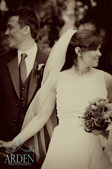
Image #2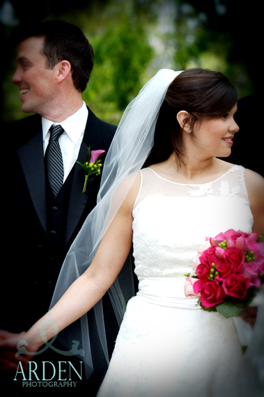
Image #3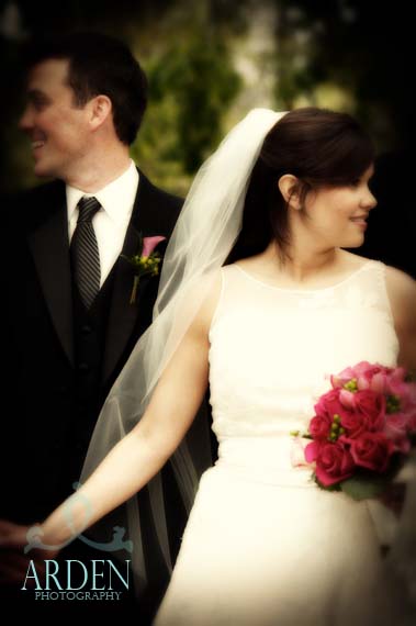
This is one of my favorite shots from Mikel and Matthew’s wedding but I can’t decide which way I like the image processed the best.
So you vote….
Let me know how you like it!
Image #1
Image #2
Image #3
April 19th, 2008 at 1:52 pm
I like the Old School version – very cool!
April 22nd, 2008 at 10:07 pm
I like the full color version myself.
April 23rd, 2008 at 5:57 pm
i love the black and white!
April 23rd, 2008 at 11:42 pm
I like Image #1, the b/w; it almost looks sepia. Classic. Awesome work Arden! ~Erica, Bliss Event Group
April 25th, 2008 at 2:45 am
Thanks for checking the images out and letting me know what you think!
April 25th, 2008 at 4:23 am
#3 – for sure 🙂
April 25th, 2008 at 3:56 pm
I like the first one in sepia- it gives it an authentic ‘old timey’ feel!
April 25th, 2008 at 4:03 pm
I like the overall style of #3…but…slightly bothersome that we can’t see groom’s hand…it looks like the bride is starting the Honeymoon (c:
April 25th, 2008 at 4:54 pm
i love the first one!
April 25th, 2008 at 9:22 pm
i love the first one…and the third one is beautiful too!!! can’t wait to see our pics!
April 28th, 2008 at 6:51 pm
I loved the third one. Great Job!!
May 4th, 2008 at 12:05 am
Preferred first and second for detail of groom’s face, second for detail of white gown, which is somewhat blown out; the third for overall color, a bit more saturated and redder, also like the blur, it softens their faces—tho perhaps a bit too much in this case. By the way, I’m Kristen’s G-paw.